I’ve been focused on art and design for the new and upcoming books, that’s a given. The new cover for Liquid Hitler (above) was created by MidJourney, the notoriously controversial AI art-thing. But the older books will also be available for retail sellers through Ingram. Forex: Who could forget the AMAZING cover for Fragments 1 by Jessica Dueck of StarsColdNight:

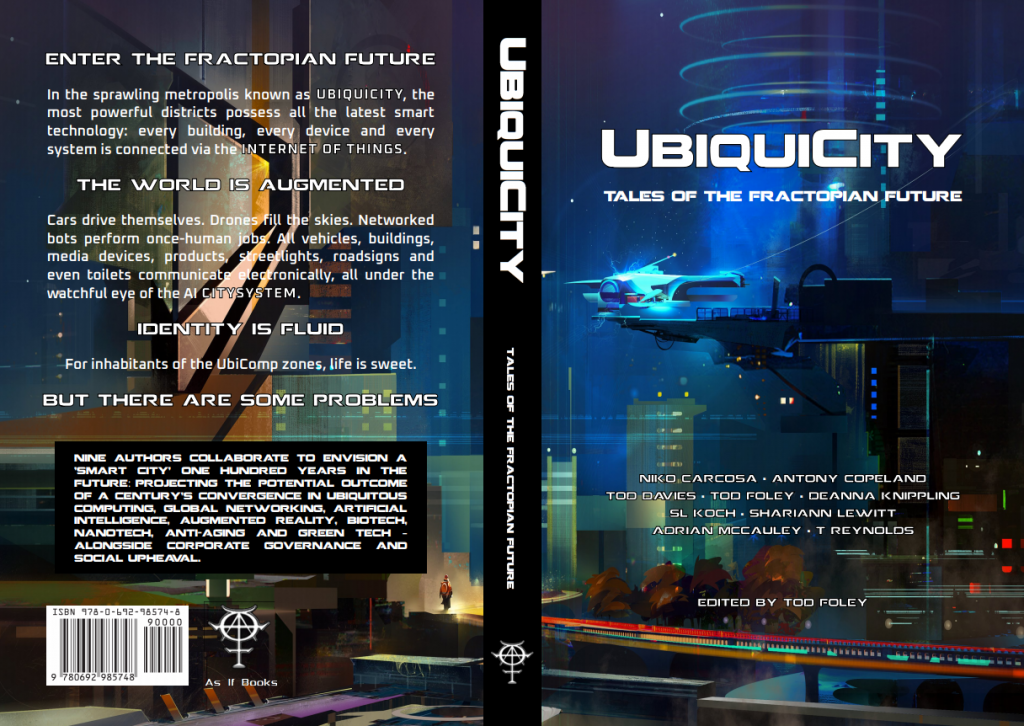
UbiquiCity book 1 (2nd pressing) sees only a few minor fixes on the inside (and now sports a more “modern” page layout), but outside, the colors and names pop a bit more, and the blurb has been punched up. I think a core aspect of my book cover design strategy is making you look closer.
All of which brings us to a bit of Book Cover Design Philosophy, and it’s slightly different depending on your market/medium:
FOR PHYSICAL BOOKS — The title is to make you look at the front. The front is to make you look at the back. The back asks a question & implies that the answer is inside.
FOR ONLINE BOOKS — The thumbnail is to make you click, The blurb asks the question, makes you peek, and reviews get final veto.
Okay, class dismissed.
My office will be open in 30 minutes.
